

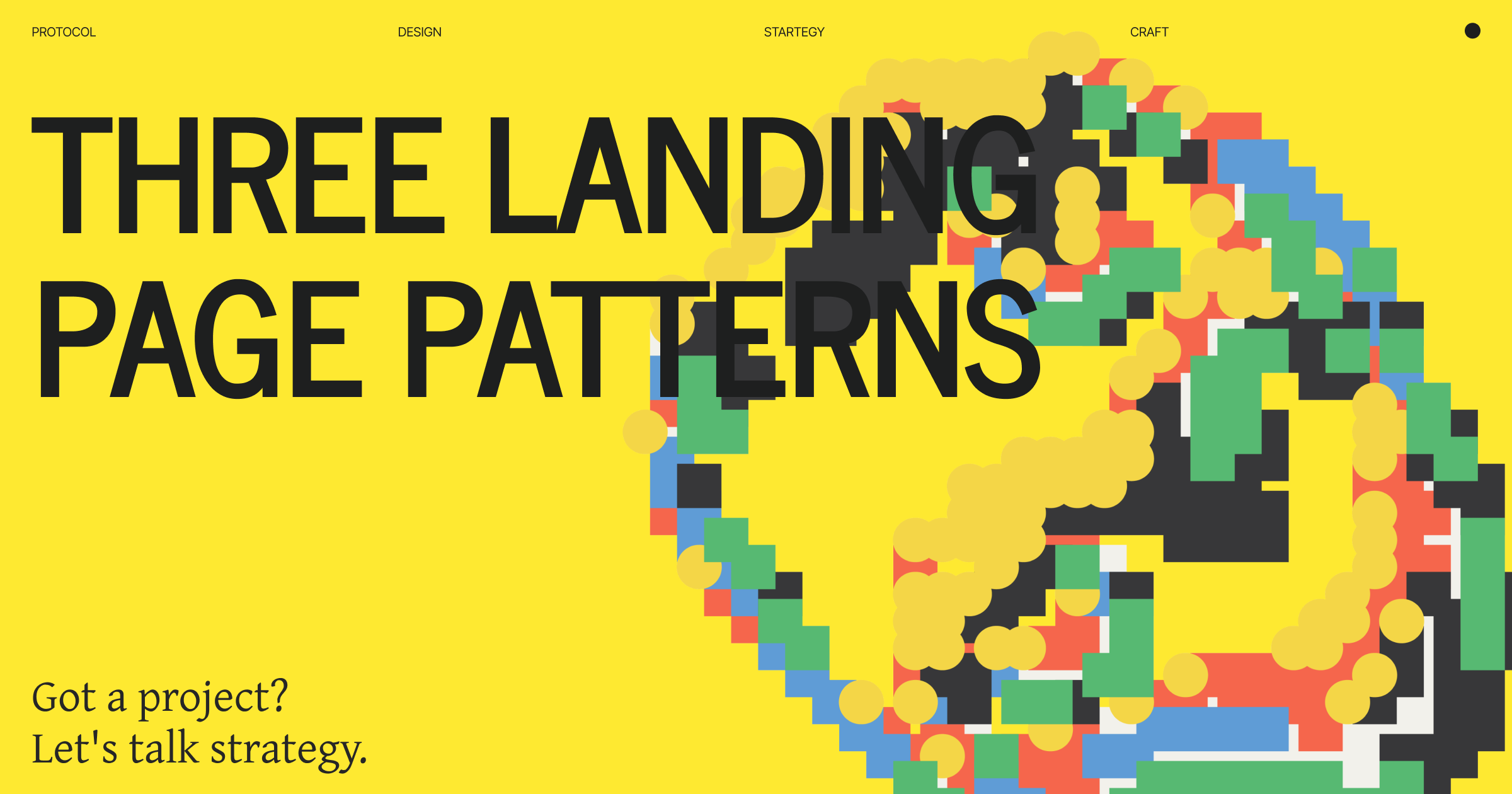
Three Landing Page Patterns
Technical spec sheet, consumer pitch, or ecosystem play

Your landing page is your positioning in visual form.
After analyzing hundreds of web3 landing pages, I’ve identified three distinct patterns that work. Not variations - fundamentally different approaches serving different audiences and business models.
Type 1: Technical Spec Sheet
For builders. Lead with capabilities, architecture, performance.
Type 2: Consumer Pitch
For end users. Lead with benefits, simplicity, outcomes.
Type 3: Ecosystem Play
For community. Lead with network, participants, shared mission.
Each works excellently for the right product. Each fails miserably for the wrong product.
Here’s how to know which is yours.
Type 1: The Technical Spec Sheet
What it is: Landing page that reads like architecture documentation with better design.
Who it’s for: Developers, technical decision-makers, protocol integrators, infrastructure users.
Visual Characteristics
Information density: High. Lots of content above fold. Data, stats, technical diagrams visible immediately.
Typography: Monospace fonts common. Code snippets featured. Technical aesthetic throughout.
Color palette: Often darker. Blues, greens, terminal-inspired. Serious, credible, technical.
Layout: Structured, grid-based, organized. Feels like documentation designed well.
Imagery: Architecture diagrams, technical illustrations, data visualization. Not photography.
Content Structure
Hero section shows:
What it is (one technical sentence)
Key specs (TPS, finality, cost)
“Start building” or “Read docs” CTA
Maybe code snippet showing integration
Below fold:
Architecture overview
Performance benchmarks
Security features
Integration documentation
API references
Technical blog posts
What’s notably absent:
Consumer benefits
Use case stories
Emotional appeal
Non-technical explanations
Lifestyle imagery
Language Patterns
Headlines are technical:
“Ethereum L2 with optimistic rollups”
“Sub-second finality with PoS consensus”
“EVM-compatible with native account abstraction”
Copy assumes knowledge:
Terms aren’t explained
Jargon is expected
Precision over accessibility
Technical accuracy matters most
CTAs are builder-focused:
“Start building”
“Read documentation”
“Deploy contract”
“Run node”
“Join testnet”
Who Does This Well
Arbitrum (Early)
What they showed:
Optimistic rollup technology explained
Transaction throughput specs
Security model detailed
Developer tools prominent
Technical blog featured
Why it worked: They were selling to DeFi protocols and dApps who needed to understand the technology to build on it.
Alchemy
What they show:
API capabilities upfront
Performance metrics visible
Integration code samples
Technical documentation prominent
Developer-first language
Why it works: Their customers are developers who need to evaluate technical capabilities before trying.
The Graph
What they show:
Indexing protocol explained
Querying capabilities featured
GraphQL examples prominent
Technical architecture visible
Performance benchmarks
Why it works: Protocol targeting developers building applications who need to understand how subgraphs work.
When Type 1 Works
✓ Your users are developers
They want specs, not stories
✓ Technical capability is differentiator
Speed/security/architecture matters most
✓ Integration is core action
Users need to build on/with your product
✓ Decision is technical evaluation
“Can this do what we need?” not “Will this solve my problem?”
✓ Competition is on capabilities
Other solutions compared by features/performance
✓ Your buyers understand the space
No education needed, just specifics
When Type 1 Fails
✗ End users, not developers
Technical specs confuse instead of convince
✗ Consumer application
Users care about outcomes, not architecture
✗ Mainstream audience
Jargon creates barrier
✗ Positioning on simplicity
Technical landing page contradicts simple positioning
✗ Emotional decision
Brand, trust, feeling matter more than specs
Type 2: The Consumer Pitch
What it is: Landing page that sells outcome and experience, not technology.
Who it’s for: End users, mainstream consumers, people solving specific problems.
Visual Characteristics
Information density: Low. Generous white space. One message at a time.
Typography: Clean, readable, friendly. Sans-serif, humanist fonts. Nothing technical.
Color palette: Varies widely. Can be bright, playful, or premium. Not dark/technical.
Layout: Spacious, flowing, storytelling. Guides you through message.
Imagery: People using product. Lifestyle photography. Emotional, relatable.
Content Structure
Hero section shows:
What it does for you (benefit, not feature)
Compelling visual (screenshot or illustration)
Clear value proposition
Simple CTA (”Get started,” “Download,” “Sign up”)
Below fold:
Key benefits (outcomes, not features)
How it works (simple, visual)
Social proof (users, testimonials, logos)
Trust signals (security, backed by)
Another CTA
What’s notably absent:
Technical specifications
Architecture details
Code samples
Jargon
Complexity
Language Patterns
Headlines are outcome-focused:
“Send money across borders instantly”
“Your crypto wallet, simplified”
“Collect digital art you love”
Copy is conversational:
Short sentences
Active voice
Plain language
Explains everything
Accessible to anyone
CTAs are action-focused:
“Get started free”
“Download now”
“Try it free”
“Join [number] users”
Who Does This Well
Coinbase
What they show:
“Jump start your crypto portfolio”
Benefits (earn rewards, learning, etc.)
Simple interface screenshots
Trust signals (secure, regulated, insured)
User count social proof
Why it works: Targeting mainstream users who need confidence, not technical details.
Phantom
What they show:
“A friendly crypto wallet”
Beautiful interface visuals
Simple explanation of what it does
App store badges
User testimonials
Why it works: Consumer wallet competing on experience and approachability, not features.
Rainbow
What they show:
“The fun, simple, and secure way to get started with crypto”
Gorgeous interface screenshots
Social proof
Clear benefits
Download CTA
Why it works: Premium consumer positioning requires premium consumer landing page.
When Type 2 Works
✓ End users, not builders
Solving user problems, not providing infrastructure
✓ Mainstream audience
People unfamiliar with crypto terminology
✓ Positioning on simplicity/ease
“Easy” claim needs easy-looking landing page
✓ Emotional decision factors
Trust, confidence, feeling matter
✓ Competition includes non-crypto
Compared to Venmo, not just other wallets
✓ Consumer brand
Building lifestyle/identity brand
When Type 2 Fails
✗ Technical buyers
Developers see it as lacking substance
✗ B2B infrastructure
Decision-makers need technical evaluation
✗ Protocol/platform
Builders need to understand what they’re building on
✗ Feature-dense product
Can’t hide complexity that actually exists
✗ Technical differentiation
If tech is your moat, hiding it doesn’t help
Type 3: The Ecosystem Play
What it is: Landing page that sells network, community, shared mission.
Who it’s for: Contributors, community members, builders who want to be part of movement.
Visual Characteristics
Information density: Medium. Shows activity, participants, ecosystem vibes.
Typography: Varies but tends toward bold, confident. Makes statements.
Color palette: Strong brand colors. Creates identity and unity.
Layout: Dynamic, energetic. Shows motion and growth.
Imagery: Community, events, ecosystem participants. Shows people and activity.
Content Structure
Hero section shows:
Mission/vision (aspirational)
Ecosystem stats (developers, apps, users)
Community CTA (”Join us,” “Start building,” “Get involved”)
Below fold:
Ecosystem participants (apps, builders, partners)
Community stats and growth
Events and programs
Multiple ways to participate
Shared values/principles
What’s notably absent:
Single product focus
One target user
Traditional conversion funnel
Singular CTA
Language Patterns
Headlines are communal:
“Build the future of [category]”
“Join [number] builders creating [vision]”
“For the [community identity]”
Copy is inclusive:
“We” and “our” frequently
Community-first language
Mission-driven messaging
Shared values emphasized
CTAs are participation-focused:
“Join the community”
“Start building”
“Get involved”
“Contribute”
“Be part of [movement]”
Who Does This Well
Solana
What they show:
“Powerful for developers. Fast for everyone.”
Ecosystem stats (apps, developers, users)
Breakpoint conference featured
Community programs
“Build for billions” mission
Why it works: Selling ecosystem membership, not just chain usage. Community is the product.
Optimism
What they show:
“Building the future together”
Public goods focus
Ecosystem of projects
RetroPGF program
“Stay optimistic” community values
Why it works: Positioning as values-driven community, not just technical solution.
Farcaster
What they show:
“A sufficiently decentralized social network”
Apps built on Farcaster
Developer resources
Community channels
Ecosystem growth stats
Why it works: Protocol succeeds through ecosystem adoption, not direct user growth.
When Type 3 Works
✓ Network effects are moat
Value increases with participants
✓ Multi-sided platform
Different participants (builders, users, contributors)
✓ Protocol, not product
Infrastructure for ecosystem
✓ Community-driven growth
Organic adoption through participation
✓ Values/mission matter
Philosophical alignment drives adoption
✓ Long-term vision
Building for years, not quarters
When Type 3 Fails
✗ Early stage (no ecosystem yet)
Can’t sell community you don’t have
✗ Single-player product
No network effects to emphasize
✗ Needs immediate conversion
Ecosystem messaging is slow-burn
✗ B2C consumer app
Users don’t care about ecosystem, just utility
✗ Traditional SaaS
No community element to leverage
The Decision Framework
How to choose which type fits your product:
Step 1: Know Your Primary User
Developers/builders → Type 1
They need technical evaluation
End users/consumers → Type 2
They need simple value proposition
Community/ecosystem participants → Type 3
They need to understand the movement
Step 2: Know Your Differentiation
Technical capability → Type 1
Show what makes you better technically
User experience → Type 2
Show the ease and benefit
Network/community → Type 3
Show the ecosystem and mission
Step 3: Know Your Business Model
Infrastructure/API/Protocol → Type 1 or 3
Builders integrate (Type 1) or ecosystem builds on you (Type 3)
Consumer application → Type 2
Direct user acquisition and retention
Platform/ecosystem → Type 3
Value from network participants
Step 4: Know Your Competition
Other technical solutions → Type 1
Compete on capabilities
Consumer apps (crypto or not) → Type 2
Compete on experience
Other ecosystems → Type 3
Compete on community/vision
Step 5: Know Your Stage
Pre-product-market fit → Type 1
Need believers/builders who understand what you’re building
Growth stage → Type 2
Need mainstream adoption
Ecosystem building → Type 3
Need community participation
Common Mistakes
Mistake 1: Type Mismatch
The problem: Consumer product with technical landing page. Or infrastructure with consumer pitch.
Example: Wallet app leading with “EIP-4337 account abstraction” instead of “Simple and secure.”
Fix: Match landing page type to your actual primary user.
Mistake 2: Hedging Between Types
The problem: Trying to be half-technical, half-consumer, half-ecosystem.
Example: Hero shows technical specs, next section is consumer benefits, then ecosystem stats. Confusing for everyone.
Fix: Pick one primary type. Commit fully. Other audiences can have separate pages.
Mistake 3: Copying Competitors Wrong Type
The problem: Successful competitor uses Type 2, you copy format but you’re Type 1 product.
Example: Infrastructure product copying Phantom’s consumer page. Feels off.
Fix: Copy strategy from similar product types, not just successful products.
Mistake 4: Type 3 Too Early
The problem: Ecosystem landing page when you have no ecosystem yet.
Example: “Join our thriving community” with 50 Discord members.
Fix: Start Type 1, evolve to Type 3 when you actually have ecosystem.
Mistake 5: Wrong Language for Type
The problem: Using consumer language on technical page, or vice versa.
Example: Type 1 page saying “magical experience” instead of “performance benchmarks.”
Fix: Language must match type. Technical for Type 1, accessible for Type 2, communal for Type 3.
Can You Mix Types?
Short answer: Not really. One must be primary.
What works:
Type 1 primary, Type 2 page for end users (separate URL)
Type 2 primary, Type 3 section showing community
Type 3 primary, Type 1 documentation linked
What doesn’t work:
Mixing messages on same page
Switching halfway through
No clear primary audience
The pattern: Pick primary type for homepage. Other types can have dedicated pages deeper in site.
Evolution Paths
Some products evolve through types:
Type 1 → Type 3
Start: Technical page for developers
Evolve: Ecosystem page as community grows
Example: Ethereum (technical → ecosystem)
Type 2 → Type 3
Start: Consumer pitch for users
Evolve: Ecosystem page as network grows
Example: Farcaster (app → protocol ecosystem)
Type 1 → Type 2
Start: Technical page for believers
Evolve: Consumer page for mainstream
Usually: Requires separate product/brand
Example: MetaMask (started technical, should split)
Critical: Evolution usually means splitting audiences, not changing one page to serve everyone.
Implementation Guide
For Type 1 (Technical Spec Sheet):
Hero must have:
Technical description (one precise sentence)
Key specs (3-5 most important)
Code snippet or technical diagram
“Documentation” CTA
Below fold:
Architecture explanation
Performance benchmarks
Security details
Integration guide
API documentation link
Technical blog
Don’t include:
Consumer benefits
Lifestyle imagery
Emotional appeals
Simplified explanations
For Type 2 (Consumer Pitch):
Hero must have:
Benefit-focused headline
Product screenshot/visual
Clear value proposition
Simple CTA
Below fold:
3-5 key benefits
How it works (visual, simple)
Social proof
Trust signals
Another CTA
Don’t include:
Technical jargon
Architecture details
Developer focus
Complexity
For Type 3 (Ecosystem Play):
Hero must have:
Mission statement
Ecosystem stats
Community visual
Participation CTA
Below fold:
Ecosystem participants
Community programs
Multiple entry points
Shared values
Events/gatherings
Don’t include:
Single product focus
One user type only
Traditional sales pitch
Narrow conversion goal
The Audit
Test your current landing page:
Look at your hero section. What’s the first thing visitors see?
Technical specs → Type 1
User benefit → Type 2
Mission/community → Type 3
Look at your imagery. What’s shown?
Diagrams/code → Type 1
Product in use → Type 2
Community/events → Type 3
Look at your CTA. What’s the first action?
“Read docs”/”Start building” → Type 1
“Sign up”/”Download” → Type 2
“Join community”/”Get involved” → Type 3
Now ask: Does this match who you’re actually for?
If mismatch: Your landing page is confusing your audience.
The Bottom Line
Three landing page types work:
Type 1: Technical Spec Sheet
For builders. Show capabilities, architecture, performance.
Type 2: Consumer Pitch
For end users. Show benefits, simplicity, outcomes.
Type 3: Ecosystem Play
For community. Show network, participants, mission.
Right type depends on:
Who your primary user is
What differentiates you
Your business model
Your stage
Most problems come from:
Type mismatch (consumer product, technical page)
Hedging between types (confusing everyone)
Copying wrong type (infrastructure copying consumer page)
Pick your type. Commit fully. Other audiences get separate pages.
Your landing page is your positioning in visual form. Make sure they match.
Thank you :)
If your project needs design, brand, product, strategy, and leadership,
let’s talk, hi@dragoon [dot] xyz | Follow: 0xDragoon