

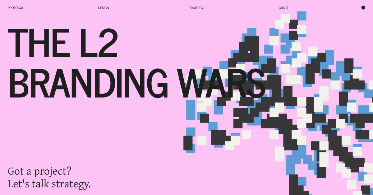
The L2 Branding Wars
Why they all look blue - and which will escape

Open any L2 website.
Arbitrum: Blue. zkSync: Blue. Linea: Blue-ish. Starknet: Blue. Scroll: Beige (finally, different).
Same tech stack. Same color palette. Same problem.
Ethereum has 20+ L2s. Most look related. Some look identical.
This isn’t accident. It’s strategy. But it’s becoming problem.
The dilemma:
Look like Ethereum → Credible but invisible Look different → Noticeable but risky
Most chose credible. Result: Invisible in sea of blue.
A few chose different. Result: Stand out but face skepticism.
Here’s why they all look the same - and which branding strategies will break through.
The Blue Problem
Why every L2 is blue:
Ethereum is blue. Being blue says: “We’re Ethereum.”
The association:
Blue = Ethereum credibility
Blue = “Real” scaling solution
Blue = Developer familiarity
Blue = Safe choice
Makes sense early.
When L2s were new, proving Ethereum connection was critical. Blue did that.
Doesn’t make sense anymore.
Now there’s 20 blue L2s. Being blue doesn’t differentiate. It commodifies.
The pattern I see:
Phase 1 (2020-2022): Blue = Ethereum credibility
Smart strategy
Differentiation through tech
Color = trust signal
Phase 2 (2023-2024): Blue = commodification
Everyone blue now
No visual differentiation
Color = invisible
Early adopters had reason. Late adopters copied without thinking.
Pattern 1: Ethereum Blue (Play it Safe)
Strategy: Look as Ethereum-like as possible. Don’t rock boat.
Who Does This:
Arbitrum:
Blue and white
Ethereum logo prominent
“Ethereum scaling” everywhere
Visual language: Ethereum derivative
zkSync:
Blue and purple (Ethereum colors)
“zkEVM” prominent (Ethereum-compatible)
Design system: Ethereum-adjacent
Linea:
Blue and dark
ConsenSys-backed (Ethereum company)
Positioning: Ethereum extension
The philosophy:
“We’re not new chain. We’re Ethereum scaled.”
Blue communicates this instantly.
Why This Made Sense:
2021-2022 context:
Users asked: “Is this real Ethereum? Or alt-L1 pretending?”
Blue answered: “Real Ethereum. Just faster/cheaper.”
Security through association.
Blue = Ethereum = tested = safe.
Developer acquisition.
“Build on us = build on Ethereum” message clear.
Why This Is Problem Now:
Can’t tell them apart.
Arbitrum screenshot vs zkSync screenshot vs Linea screenshot.
Similar blue. Similar layouts. Similar messaging.
No distinctive positioning.
All: “Ethereum scaling.” All: “Fast and cheap.” All: “zkEVM” or “Optimistic.”
Nothing differentiates visually or message-wise.
Who This Works For:
✅ First movers (Arbitrum established before crowded) ✅ Strong tech differentiation (when tech clearly better) ✅ Developer-focused (not consumer brand) ✅ Enterprise sales (conservative buyers prefer safe)
❌ Late entrants (invisible in sea of blue) ❌ Consumer-focused (need differentiation) ❌ Competitive markets (everyone has similar tech)
The Outcome:
Arbitrum: Blue worked. First mover advantage. TVL leader.
Everyone else: Blue doesn’t differentiate anymore.
Pattern 2: Contrarian Color (Stand Out)
Strategy: Choose opposite of blue. Deliberate differentiation.
Who Does This:
Optimism:
Red (opposite of blue)
“The Optimistic Ethereum”
Design system: Bold, contrarian
Branding: Confident alternative
Scroll:
Beige/cream/orange
“Native zkEVM”
Design: Warm, different
Positioning: Alternative approach
The Philosophy:
“We’re Ethereum L2. But we’re different.”
Red/beige says: Stand out. Be noticed. Be alternative.
Why This Is Bold:
Breaking Ethereum color association.
Blue = safe. Red/beige = risky.
Users might think: “Not real Ethereum?”
But also creates:
Instant recognition (”the red one”)
Visual differentiation (can’t confuse with others)
Brand strength (committed to choice)
Position clarity (alternative option)
Optimism’s Bet:
Red works because:
Instant identification - “Use the red L2”
Confident positioning - Not hiding, standing out
Emotional differentiation - Red = energy vs blue = stability
Full commitment - Not half-measure, all-in red
Could fail because:
Red doesn’t say “Ethereum”
Users might see as less credible
Breaks category expectations
So far: Working.
Optimism has clear brand position. Recognizable. Growing TVL.
Scroll’s Bet:
Beige/cream/orange works because:
Completely different - Nobody else using warm tones
Approachable - Warm vs cold blue
Fresh - Feels new, not derivative
Technical focus - Doesn’t rely on color association
Could fail because:
Unusual for crypto (risk)
Might feel less “technical”
Warm tones = less serious?
So far: Too early. Launched recently. Different is noticeable.
Who This Works For:
✅ Strong position (can own contrarian choice) ✅ Later entrants (need differentiation) ✅ Consumer-focused (recognition matters) ✅ Bold team (commit to unconventional)
❌ Risk-averse (contrarian feels dangerous) ❌ Following not leading (contrarian requires confidence) ❌ Weak tech (can’t rely on just color)
The Outcome:
Contrarian color creates recognition.
Costs: Initial skepticism. Benefit: Long-term differentiation.
Trade-off some chose. Most didn’t dare.
Pattern 3: Parent Brand Shadow (The Base Problem)
Strategy: Leverage parent brand. But struggle to escape shadow.
The Example: Base
Coinbase’s L2.
Branding:
Blue (Coinbase blue)
Design language: Coinbase derivative
Messaging: “Built by Coinbase”
The strategy: Leverage Coinbase credibility.
Makes sense. Coinbase = trusted. Base = trusted by association.
Why This Creates Problem:
Base looks like Coinbase product.
Not independent chain. Coinbase feature.
User perception:
“Coinbase’s chain” (not “Base”)
Product not platform
Extension not ecosystem
Developer perception:
“Coinbase-controlled”
Less neutral than Arbitrum/Optimism
Platform risk (Coinbase decides future)
The Shadow Problem:
Benefits of parent brand:
Instant credibility
User trust
Distribution (Coinbase has millions of users)
Resources
Costs of parent brand:
No independent identity
Always “Coinbase’s thing”
Can’t escape parent’s reputation
Hard to build separate brand
The Tension:
Coinbase helps Base launch.
But Base needs to become more than Coinbase product to succeed as L2 ecosystem.
Other L2s: Independent positioning. Own brand. Own future.
Base: Coinbase’s chain. Coinbase’s brand. Coinbase’s future.
For now: Distribution wins.
Coinbase integrated Base. Millions using it. TVL growing.
Long-term: Identity problem.
Developers building on Base = building on Coinbase platform?
Who This Pattern Works For:
✅ Consumer adoption (parent brand trust) ✅ Initial distribution (parent’s users) ✅ Credibility (established company backing)
❌ Developer ecosystem (want neutral platform) ❌ Long-term independence (always in shadow) ❌ Competitive differentiation (parent brand is ceiling)
The Outcome:
Base growing fast. But as Coinbase product, not independent L2.
Different challenge than other L2s.
Pattern 4: Technical Differentiation (Brand Through Tech)
Strategy: Brand around technical difference. “We’re the ZK one” or “We’re the EVM-equivalent one.”
Who Does This:
Starknet:
“The Starknet” (unique VM)
Cairo language
Positioning: Most advanced ZK
Different tech = different approach
zkSync:
“Native zkEVM”
ZK proof focus
Marketing: Technical superiority
Polygon zkEVM:
“EVM-equivalent”
Technical accuracy
Developer familiar
The Philosophy:
“Our tech is different. That’s our brand.”
Technical differentiation = brand differentiation.
Why This Is Hard:
Users don’t care about ZK proofs.
Developers care. Users want: Fast, cheap, works.
All L2s have technical story:
Optimism: Optimistic rollups
Arbitrum: Optimistic with fraud proofs
zkSync: zkEVM
Starknet: Cairo/STARK proofs
Polygon: Multiple solutions
Everyone claims technical superiority.
Hard to differentiate on tech when everyone’s technical.
When Technical Branding Works:
✅ Clear technical advantage (provably better) ✅ Developer-focused product (tech matters to audience) ✅ Long-term differentiation (tech stays unique)
❌ Consumer products (users don’t understand tech) ❌ Commodified tech (everyone has similar claims) ❌ Tech parity (competitors catch up)
The Challenge:
Starknet’s technical uniqueness real.
Different VM. Different approach. Actually different.
But: How many users care? Developers care. Ecosystem growth slower.
zkSync’s zkEVM claim:
Also: Scroll’s zkEVM. Polygon’s zkEVM. Linea’s zkEVM.
Everyone has “zkEVM” now. Doesn’t differentiate.
The Outcome:
Technical differentiation works until competitors copy.
Then need other differentiation.
Pattern 5: Community/Culture Branding
Strategy: Build brand through community, not just visuals.
Who Does This:
Optimism:
Retroactive public goods funding
“Optimistic vision” philosophy
Community governance (Optimism Collective)
Values-driven, not just tech
Polygon:
“Aggregated blockchain networks”
India/global community focus
Gaming/NFT community
Ecosystem diversity
The Philosophy:
“We’re not just chain. We’re movement/community/vision.”
Brand = Values + Community + Culture.
Not: Blue vs red. But: What we stand for.
Why This Works:
Harder to copy values than colors.
Can copy Optimism’s red. Can’t copy their governance model.
Can copy Polygon’s purple. Can’t copy their community.
Creates:
Loyal community (believes in mission)
Differentiated positioning (only one with these values)
Narrative beyond tech (story to tell)
Long-term moat (community compounds)
The Examples:
Optimism’s public goods funding:
Unique position: “We fund Ethereum infrastructure.”
Not: “We’re fastest.” (Can be beaten) But: “We give back.” (Can’t be copied without same commitment)
Polygon’s ecosystem approach:
“Aggregated networks” not “our L2.”
Multiple solutions. Different approach. Distinctive position.
Who This Works For:
✅ Long-term thinking (community takes time) ✅ Mission-driven (authentic values) ✅ Ecosystem play (not just technology) ✅ Patient capital (community ROI is slow)
❌ Short-term growth (community builds slowly) ❌ Purely mercenary (values must be real) ❌ Tech-only focus (need culture component)
The Outcome:
Creates differentiation beyond visuals.
Optimism = public goods. Polygon = ecosystem aggregator.
Positions that competitors can’t easily copy.
Which Will Break Out
Based on patterns, here’s who escapes commodity:
Winners: Differentiated Position
Optimism:
✓ Contrarian color (red)
✓ Values-driven (public goods)
✓ Community governance
✓ Technical credibility (Optimistic rollups)
Why they break out: Multiple differentiation layers. Can’t confuse with others.
Base:
✓ Coinbase distribution
✓ Consumer access
✓ Integrated experience
Why they break out: Different game. Not independent L2, Coinbase’s scaling. Wins through parent.
Polygon:
✓ Ecosystem approach (not single L2)
✓ Community strength
✓ Multiple solutions
Why they break out: Different strategy entirely. Aggregator not single chain.
Stuck: Blue Sea Swimmers
Arbitrum:
✓ First mover advantage (already broke out)
✓ TVL leader
✗ But blue strategy won’t help future L2s
zkSync, Linea, Starknet:
Technical differentiation (good)
Blue/similar colors (commodified)
Need non-visual differentiation
Breaking out requires: More than blue. More than “we’re ZK.” Need distinctive position.
The Pattern:
Will break out:
Multiple differentiation vectors
Clear positioning beyond tech
Visual OR cultural differentiation (ideally both)
Will struggle:
Single differentiation (just tech)
Blue without other differentiation
“Ethereum L2” as only message
The Breakout Playbook
If you’re new L2 or rebranding:
Step 1: Choose Your Differentiation
Can’t differentiate on:
“Fast and cheap” (everyone is)
“Ethereum scaling” (everyone claims)
“Secure” (table stakes)
Blue color (overdone)
Can differentiate on:
Contrarian position (Optimism’s public goods)
Different audience (gaming, social, DeFi-specific)
Technical uniqueness that matters (Starknet’s Cairo)
Ecosystem approach (Polygon’s multi-chain)
Distribution (Base’s Coinbase)
Step 2: Visual Differentiation
If differentiated position: Can be blue. Position carries brand.
If commodity position: Must be visually different. Only path to recognition.
Options:
Contrarian color (Optimism red, Scroll beige)
Unique design system (not Ethereum derivative)
Distinctive visual language
Step 3: Commit Fully
Half-measures fail.
Can’t be “kind of red” or “slightly different.”
Optimism went all-in red. Everywhere. Consistent.
Scroll went all-in beige/cream. Committed.
Partial differentiation = still invisible.
Step 4: Build Non-Visual Moat
Color can be copied.
Community can’t. Values can’t. Distribution can’t. True technical difference can’t.
Visual differentiation gets attention. Non-visual differentiation keeps it.
The Future
Next 2 years, prediction:
Consolidation:
20+ L2s → 5-7 dominant.
Winners will have:
Clear differentiation (technical, cultural, or distribution)
Visual recognition (contrarian or first-mover)
Ecosystem strength (apps, users, TVL)
Losers will be:
Blue without differentiation
“Ethereum L2” without unique angle
Technical claims without user traction
The Blue Problem Worsens:
More L2s launching.
All will face: Be blue (invisible) or be different (risky)?
Most will choose blue. Most will be invisible.
Those who choose different early win recognition.
The New Differentiation:
Next wave won’t compete on:
Speed (all fast enough)
Cost (all cheap enough)
Security (all secure enough)
Will compete on:
Use case specificity (gaming L2, social L2, DeFi L2)
Distribution (which apps/ecosystems choose them)
Community/values (why developers/users care)
Visual branding reflects this.
Generic L2s look generic (blue). Specific L2s look specific (unique).
Bottom Line
L2s all blue because: Ethereum credibility through color association.
Made sense when L2s were new. Doesn’t make sense now.
The patterns:
Ethereum Blue: Safe but invisible (Arbitrum, zkSync, Linea) Contrarian Color: Risky but memorable (Optimism red, Scroll beige) Parent Brand: Distribution but shadow (Base/Coinbase) Technical Brand: Differentiation until copied (all ZK claims) Community Brand: Slow build but defensible (Optimism, Polygon)
Who breaks out:
Multiple differentiation vectors. Not just color. Not just tech. Position + visuals + community.
Optimism: Red + public goods + governance Base: Blue + Coinbase + distribution Polygon: Purple + ecosystem + community
Who struggles:
Blue + “Ethereum L2” + technical claims = commodity.
The lesson:
Blue was smart initially. Credibility mattered.
Blue is commodity now. Differentiation matters.
Can’t all look the same and expect different outcomes.
Most L2s chose safe (blue). Few chose risky (different).
In crowded market: Safe = invisible.
Contrarian = noticeable.
Breaking out requires breaking from pack.
Optimism chose red. Everyone thought risky. Result: Most recognizable L2 brand.
Others stayed blue. Thought safe. Result: Invisible in sea of blue.
Market will decide which strategy wins.
But recognition precedes adoption.
Can’t adopt what you can’t remember.
Red L2 is memorable. Blue L2 number 7? Not so much.
Thank you :)
If your project needs design, brand, product, strategy, and leadership,
let’s talk, hi@dragoon [dot] xyz | Follow: 0xDragoon