

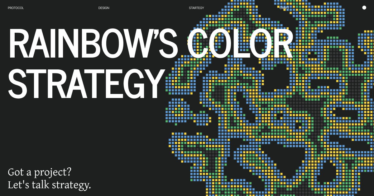
Rainbow's Color Strategy
The most beautiful Ethereum wallet was the strategy, not the surface

In 2020, most crypto wallets looked the same. Dark mode, blue accents, functional but forgettable. They prioritized security messaging over aesthetics because they thought design quality didn’t matter for technical products.
Rainbow launched with a different thesis: what if we made the most beautiful wallet and that became our entire positioning?
Not beautiful as decoration. Beautiful as strategy.
Let’s break down how they turned visual craft into competitive advantage.
What They Got Right
Rainbow made a bet that’s obvious in hindsight but felt risky at launch: a significant portion of Ethereum users care deeply about design quality.
These aren’t crypto maximalists who only care about features. They’re people who use Notion, appreciate good typography, have opinions about animations. They’re coming from consumer tech and they notice when something feels cheap.
Every other wallet was designed by developers who viewed design as surface layer. Rainbow was designed by people who understood that for certain users, craft quality is a trust signal.
Look at their approach: they didn’t build another wallet and make it pretty. They built a beautiful wallet and made sure it was functional.
That’s different. The craft came first. The features supported the positioning, not the other way around.
The name “Rainbow” itself signals this. Not “EthWallet” or “SecureVault” or something serious. Rainbow. Colorful. Optimistic. Different.
They weren’t trying to look like every other wallet. They were trying to be the one that respected design.
The Visual System
The Rainbow Gradient
Their primary identifier isn’t a single color - it’s a gradient. Pink to purple to blue, continuous spectrum.
This is technically harder than picking one brand color. Gradients are tricky. They can look dated, gaudy, or like the designer couldn’t decide.
Rainbow’s gradient works because:
It’s subtle. Not harsh neon. Soft, diffused, gentle transitions. The kind of gradient that requires craft to get right.
It’s consistent. Same angle, same color stops, same application everywhere. They didn’t randomize it or make it “fun.” They made it precise.
It’s ownable. Go to your wallet drawer. Which one is Rainbow? The gradient one. Instant recognition.
It means something. Rainbow = diversity, inclusivity, full spectrum. The visual matches the name matches the values.
Compare this to single-color wallets. Blue wallet #47. Which one was that again? Rainbow is unmistakable.
Typography Excellence
They use SF Pro (Apple’s system font) for interface and custom weights of Inter for marketing.
Why this matters: SF Pro is familiar to iOS users. It feels native, trustworthy, well-made. It’s the typography of quality consumer products.
But they don’t just use it default. They set it with care:
Generous spacing between elements
Clear hierarchy without being heavy-handed
Proper optical sizing for different scales
Attention to line length and readability
You can tell someone thought about every text element. Nothing feels default or rushed.
The Attention to Micro-Interactions
This is where craft becomes obvious. Every tap, swipe, transition has considered motion.
Haptic feedback when you complete actions. Your phone vibrates just enough to confirm something happened.
Spring animations that feel physical. Things bounce slightly when they settle. Natural, not robotic.
Loading states that are smooth, never jarring. Skeleton screens that match the content structure.
Pull-to-refresh that uses the rainbow gradient as the refresh indicator. Small detail, consistent branding.
These aren’t necessary for function. MetaMask works without them. But they signal: we care about craft. We sweat the details. You can trust us.
Icon Design Language
Rainbow’s icons are custom, not from an icon library. You can tell because they match perfectly - same rounded corners, same line weights, same style.
They use filled icons with subtle gradients (the rainbow, always the rainbow). Consistent but not boring. Each icon has personality while staying cohesive.
Compare to wallets using Material Icons or Font Awesome. Those work fine, but they don’t feel custom. They don’t feel like someone designed every detail for this specific product.
Color Beyond the Rainbow
Their secondary palette is carefully considered:
Success green: Bright but not neon
Error red: Clear but not alarming
Neutral grays: Warm, not cold
Token colors: They show each token in its brand color with good contrast
Everything has been thought through. No default hex codes, no “good enough” choices.
Empty States and Zero States
When you have no tokens, Rainbow doesn’t just say “No tokens.”
They show: beautiful illustration, clear next action, encouraging message. The empty state is designed as carefully as the full state.
This matters more than you’d think. First-time users see empty states first. If that experience is poor, they bounce before ever using the product.
Rainbow makes even the empty states feel complete.
The Strategic Intent
Here’s what Rainbow’s visual system actually communicates:
“We respect you enough to make this beautiful”
Most crypto products don’t invest in polish because they assume users only care about features. Rainbow bet that their target users notice quality and care about it.
That bet was right. The people who choose Rainbow over MetaMask often mention: “it just feels better made.”
“Crypto can be consumer-grade”
For years, crypto products looked technical because looking technical meant looking serious. Rainbow proved you could look consumer-friendly and still be trustworthy.
The polish says: we’re confident enough in our security to also care about aesthetics.
“We’re for people who come from good design”
Rainbow’s visual language speaks to people who use Apple products, appreciate Stripe’s design, follow design Twitter. It says: you’ll feel at home here.
That’s positioning through aesthetics. They’re not trying to convert everyone - they’re speaking directly to design-conscious users.
Why This Worked
Underserved market segment
Plenty of wallets existed for crypto natives who prioritized features. Almost nothing existed for design-conscious users who wanted something beautiful.
Rainbow identified an audience competitors were ignoring: people who care about craft quality and were tolerating ugly wallets.
Differentiation through obvious contrast
In a category where everything looked the same, being different was instant advantage.
When someone asks “which wallet should I use?” and sees Rainbow next to ten dark-mode blue wallets, the choice is obvious if design matters to them.
Quality as trust signal
Here’s the insight: for certain users, visual craft signals reliability.
If they care this much about animations and gradients, they probably care about security too. The polish suggests thoroughness. Attention to detail in design implies attention to detail in code.
This works in reverse too - sloppy design suggests sloppy engineering. Might not be true, but perception matters.
Network effects through identity
Rainbow users become brand ambassadors because the wallet is something they’re proud to show.
Screenshots of Rainbow look good. Sharing your wallet in Discord doesn’t feel embarrassing. The design makes users want to rep it.
That’s free marketing. Every beautiful screenshot is an ad.
Apple ecosystem alignment
Rainbow launched iOS-first. This wasn’t just a platform choice - it was audience selection.
iOS users are proven to care about design quality. They paid extra for Apple hardware partly for the aesthetics. Rainbow understood their audience already self-selected for design consciousness.
Building the most beautiful iOS wallet wasn’t a nice-to-have. It was speaking the native language of their target users.
The Design Decisions That Mattered
Launch Strategy: iOS First
Most wallets launched on desktop/web because that’s where crypto traders lived. Rainbow launched on mobile because that’s where design-conscious consumers lived.
This limited initial market but ensured every early user was their target demographic. Better to own a small audience that loves you than reach everyone with lukewarm reception.
The Token List Design
Instead of rows of text and numbers, Rainbow shows tokens with:
Large token icons
Clear hierarchy (balance most prominent)
Subtle background colors from token brand colors
Smooth scrolling with momentum
Pull-to-refresh with gradient indicator
It looks like a well-designed consumer app, not a spreadsheet.
Compare to typical wallet token lists - dense, packed with data, minimal hierarchy. Functional but not beautiful.
Rainbow chose: less data visible by default, more breathing room, clearer hierarchy. Information is there if you need it (tap for details), but the default view is clean.
Animations With Purpose
Every animation serves function:
Confirm transactions: Visual feedback that something happened
Transitions: Help users understand spatial relationships
Loading: Reduce perceived wait time
Success states: Celebrate completed actions
These aren’t decoration. They’re functional craft. The app works better because the animations help comprehension.
But they’re also beautiful. Because beautiful and functional aren’t opposites.
The Send/Receive Flow
Sending tokens in Rainbow feels different than other wallets:
Clear visual of who you’re sending to (ENS names with avatars)
Prominent amount in large type
Smooth transitions between steps
Clear confirmation with haptic feedback
Success state that feels complete
The whole flow feels considered. Every screen has purpose. No steps feel like afterthoughts.
Other wallets treat send flow as pure function: enter address, enter amount, confirm, done. Rainbow treats it as experience: clear context, smooth progression, satisfying completion.
Settings Without Overwhelm
Rainbow has extensive settings and advanced features. But the default interface shows almost none of it.
Casual user? You see: tokens, send, receive, discover. That’s it.
Power user? Everything’s there - developer settings, custom RPCs, advanced features. Just organized so you have to opt into complexity.
This is the same progressive disclosure principle, but executed with more craft than most wallets.
The Business Impact
Market capture in specific segment
Rainbow isn’t the biggest wallet. MetaMask has way more users. But among design-conscious Ethereum users, Rainbow has mindshare.
They didn’t try to beat MetaMask on features or users. They carved out their niche: the beautiful option.
Premium positioning without premium price
Rainbow is free. But it feels premium. The craft quality creates perceived value.
Users trust it partly because it looks and feels expensive to make. The polish suggests: they’re serious about this.
Hiring and team brand
Rainbow can recruit top design and engineering talent partly because the product itself is portfolio-worthy.
Working on Rainbow signals: you care about craft. That’s valuable for career.
Compare to working on generic wallet #12. Same function, different prestige.
Merchandise and cultural presence
Rainbow’s visual identity works in physical space. Stickers, shirts, swag - all recognizable and desirable.
The rainbow gradient translates to print, embroidery, physical products. It’s not just a digital brand.
At ETH events, you see Rainbow gear everywhere. That’s cultural penetration.
What This Means For You
Rainbow proves visual craft can be strategic positioning, not just polish.
Three patterns here:
1. Quality attracts quality
Rainbow’s design quality attracted design-conscious users. Those users tend to be early adopters, vocal advocates, taste-makers.
By optimizing for quality over quantity, they built an engaged core that drives word-of-mouth.
2. Niche can win
Rainbow didn’t try to be the wallet for everyone. They picked: design-conscious Ethereum users on iOS.
That narrow focus let them execute excellently. If they’d tried to serve everyone, they’d have compromised on craft.
3. Craft compounds
Every detail - gradients, animations, icons, spacing, copy - adds up to a feeling.
That feeling becomes your brand. Rainbow feels like: quality, craft, care, beauty.
Competitors could copy individual features. But copying the cumulative effect of thousands of thoughtful decisions? Much harder.
The Evolution
Rainbow started beautiful. The challenge: staying beautiful as you scale.
They’ve added:
Multi-chain support (Polygon, Arbitrum, Optimism, Base)
NFT gallery
DeFi integrations
Ethereum L2s
More complex features
Each addition risks cluttering the interface. The risk is drifting from “beautiful and simple” to “feature-complete but cluttered.”
Their opportunity: maintain craft discipline as complexity grows. Keep the default view beautiful. Hide complexity for power users. Protect simplicity as an asset.
If they do this, they stay the beautiful option even as capabilities expand. If they start adding features to match competitors without maintaining craft, they become what they disrupted.
The Pattern
Rainbow shows that in technical categories, design quality can be positioning.
Not design as decoration. Design as strategy. Visual craft as market differentiator.
Rainbow gradient instead of single color. Custom icons instead of icon libraries. Considered animations instead of none. Beautiful empty states instead of functional ones.
Result: carved out defensible position in competitive market. The beautiful wallet is their moat.
Your product might compete in a category where everyone looks the same. One option: build more features. Another option: build with more craft.
Features get copied. Craft compounds.
Rainbow chose craft. It worked.
Thank you :)
If your project needs design, brand, product, strategy, and leadership,
let’s talk. Work with me: hi@dragoon [dot] xyz | Follow: 0xDragoon