

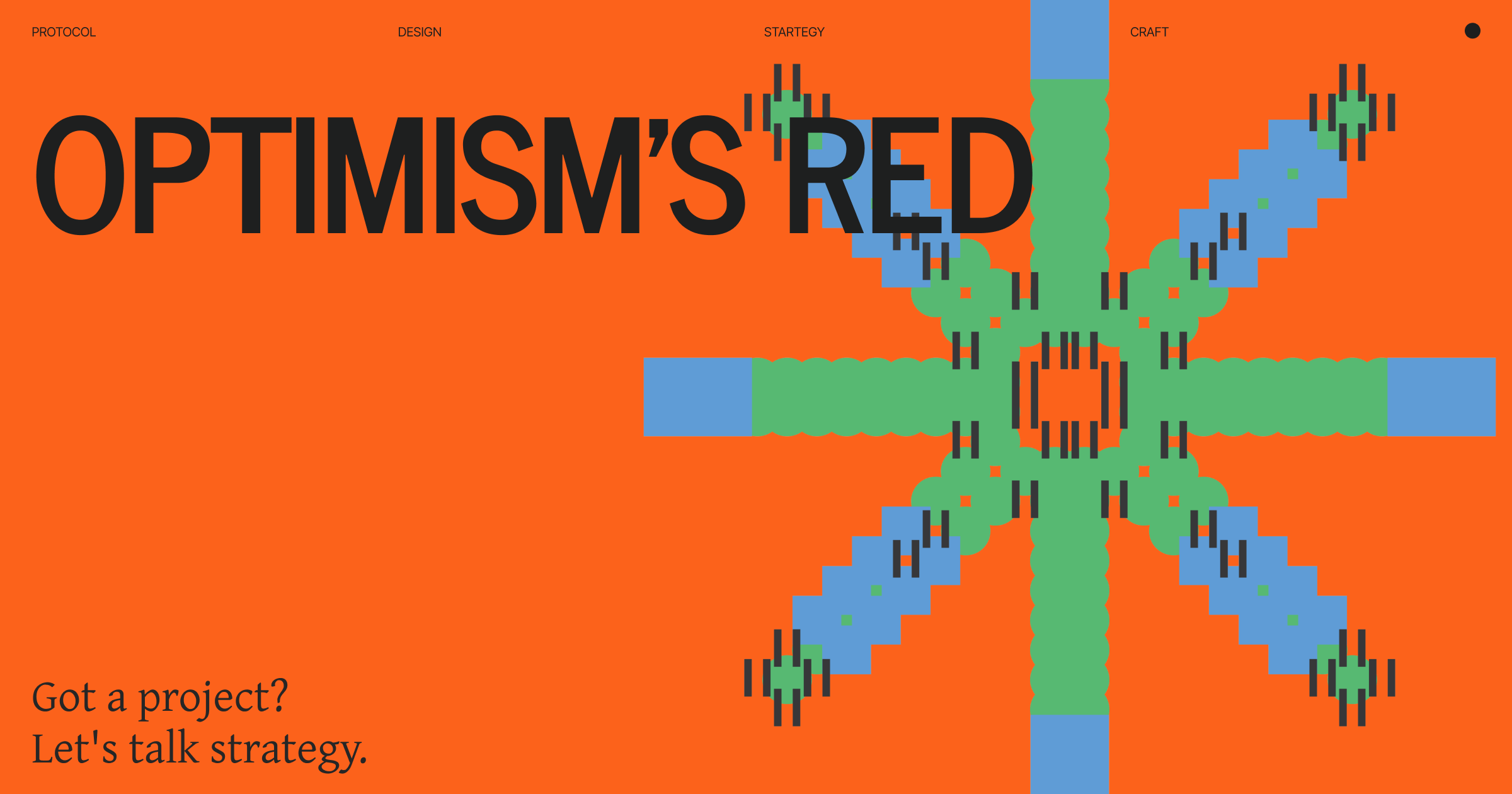
Optimism’s Red
When everyone zigs blue, zag red

Every L2 faces the same branding problem.
You’re built on Ethereum. You want Ethereum’s credibility. Blue equals Ethereum equals legitimate.
But you also need to stand out. Dozens of L2s exist. Can’t all look identical.
Most L2s solved this with blue variations.
Arbitrum: Darker blue. Base: Coinbase blue. zkSync: Purple (blue-adjacent). Starknet: Purple-blue gradient. Linea: Teal.
Optimism looked at the sea of blue and picked red.
Not blue-ish red. Not red accent on blue primary. Just red.
Bold red. Primary brand color red. Everywhere red.
This wasn’t random. It was strategic.
The L2 Dilemma
Here’s the tension every L2 faces:
Need Ethereum association. Security comes from Ethereum. Users trust Ethereum. “Built on Ethereum” = credibility.
Blue signals Ethereum. Blue signals legitimate. Blue is safe choice.
Need differentiation. Can’t be invisible. Users must remember you. Screenshot must be identifiable.
Standing out = recognition. Recognition = consideration. Can’t stand out looking identical.
The conflict: Associate closely (safety) vs differentiate clearly (recognition).
Most L2s chose: Blue, but our shade of blue.
Optimism chose: Not blue at all.
What Everyone Else Did
Look at the L2 landscape:
Arbitrum: Blue. Darker than Ethereum. Still clearly blue family.
Base: Blue. Coinbase blue. Ethereum-adjacent. Safe.
zkSync: Purple. Close to blue. Not quite blue but blue-ish.
Starknet: Purple-blue gradient. Straddling the line.
Scroll: Orange-beige. Closer to different but muted.
Linea: Teal. Blue-green. Still blue family.
The pattern: Stay in blue vicinity. Minor differentiation. Play it safe.
The result: Hard to tell apart. Show someone five L2 dashboards. They blur together.
Which one was I just using? The blue one. Helpful.
What Optimism Did
Optimism went opposite.
Bright red. Primary brand color. Everywhere.
Not red accent. Not red detail. Red identity.
Website: Red. Documentation: Red. Dashboards: Red. Conference booths: Red. Swag: Red.
Specific red: #FF0420.
Not danger red. Not corporate red. Optimistic red.
Bright. Energetic. Positive. Impossible to confuse with anyone else.
Why Red Works
Instant recognition.
Show someone screenshots of five L2s. They’ll remember Optimism.
“The red one” works as identifier. “The blue one” doesn’t.
In crowded space, different = noticed. Red is different.
Emotional contrast.
Blue signals: Trust, stability, established, serious.
Red signals: Energy, action, optimism, forward movement.
For L2 positioning as “the fast one” or “the friendly one,” red matches better than blue.
Their name is Optimism. Optimistic red reinforces it. Blue would contradict.
Contrarian positioning.
Everyone zigging blue? Zag red.
The psychology: Blue L2s say “we’re like Ethereum.” Red L2 says “we’re the alternative.”
This works when you’re not trying to be the leader. You’re trying to be the different choice.
Optimism isn’t trying to replace Ethereum. They’re trying to be “the L2 that’s not like other L2s.”
Red signals this immediately.
Space from Ethereum shadow.
Too much Ethereum association = no independent identity.
Look too much like Ethereum = you’re just “small Ethereum.” Can’t own your position.
Red creates breathing room. Says: “Built on Ethereum (security) but we’re our own thing (identity).”
The color alone establishes independence while maintaining technical relationship.
Category positioning within L2s.
When every L2 is blue, the red one can own a position.
“The optimistic L2.” “The friendly L2.”
“The different L2.”
Red enables positioning that blue (same as everyone) doesn’t allow.
How Optimism Executes Red
Having different color isn’t enough. Execution matters.
Full commitment.
This wasn’t “let’s try red as accent color.”
Red is primary. Red dominates. Red is identity.
Everywhere:
Website (primary)
Docs (headers, accents)
Dashboards (brand color)
Social (profile, graphics)
Events (stage, booth, swag)
Ecosystem (guidelines provided)
No hedging. No “red sometimes, blue other times.” Just red.
Shade precision.
Not just any red. Specific red: #FF0420.
Bright but not neon. Energetic but not aggressive. Optimistic (matches name).
Not danger red. Not stop sign. Not warning.
Positive red. Forward red. You-can-do-it red.
Wrong shade = wrong feeling. They nailed the shade.
Consistency compounds.
Same red everywhere. Same application. Same energy.
This discipline creates recognition. Allows ecosystem to use red consistently.
Compare to brands with “flexible color palette” that looks different everywhere. Confusion, not recognition.
Optimism’s red is unmistakable because it’s consistent.
Simple system.
Red + black + white. That’s it.
No “red but also purple and orange and...” Just red.
Simplicity enables consistency. Consistency creates recognition.
Ecosystem adoption.
Apps building on Optimism often use red in their branding. Not required. Chosen.
Why? Association helps. “Optimism ecosystem” visible through aesthetic.
The red creates family without mandate. Projects signal membership voluntarily.
This compounds. More apps use red → red = Optimism → more apps use red.
The Strategic Intent
What Optimism actually achieved:
Lowered cultural barrier.
Technical messaging: “You need to understand rollups to appreciate us.”
Cultural messaging: “You can feel the energy without understanding tech.”
Red contributes to this. Approachable. Energetic. Inviting.
Created ecosystem coherence.
By giving projects visual language to adopt, Optimism enabled ecosystem unity.
Not mandated unity. Voluntary unity. The valuable kind.
Browse Optimism ecosystem, you see family resemblance. Red signals membership.
Positioned for consumer.
“Fastest rollup” appeals to developers. “Build for everyone” appeals to mainstream founders.
Red supports consumer positioning. Blue feels technical. Red feels accessible.
NFTs, gaming, social apps need different energy than DeFi infrastructure. Red works for consumer.
Made competition cultural.
Before: “Are we faster than Arbitrum?” (Technical) After: “Are we building more interesting things?” (Cultural)
Red enabled competition on dimensions where new ecosystem can win against established one.
Culture, community, vibe. These favor newcomers with energy. Red signals energy.
When Red Works vs Doesn’t
This isn’t universal advice.
Red works when:
You’re not the leader. (Leaders don’t need differentiation.)
You want alternative positioning. (Different choice, not same choice.)
Your name/message matches. (Optimism = optimistic red.)
You can commit fully. (Half red = confused.)
Consumer or cultural focus. (Red fits these better than enterprise.)
Red doesn’t work when:
You’re trying to be the standard. (Standards are blue/conservative.)
Security/trust is primary concern. (Blue signals stability better.)
Enterprise/institutional focus. (They expect conservative colors.)
You can’t commit. (Red accent ≠ red identity.)
Doesn’t match your positioning. (If you’re “the serious one,” red is wrong.)
The Pattern for Others
What L2s launching now can learn:
Own a color deliberately.
Available: Yellow (speed, value), Green (growth, eco), Orange (energy, friendly).
Purple taken (zkSync). Blue crowded.
Requirements: Commit fully. Match positioning. Execute consistently.
Risk: Color alone doesn’t mean anything. You build the association.
Or own blue perfectly.
Accept blue but execute flawlessly. Professional over distinctive.
Coinbase does this. Specific blue. Perfect application. Excellence, not novelty.
Works if excellence is differentiator, not novelty.
Or go beyond color.
Distinctive shape, pattern, system. Recognition through form.
Harder to execute. Requires design excellence. But possible.
The key: Choose deliberately. Commit fully. Match position.
Don’t choose blue because “that’s what blockchains do.” Choose the color that communicates your position.
The Challenges
Red isn’t perfect:
Association management.
Not every Optimism project wants red. Some need different aesthetic.
Optimism handles this well. Strong identity but doesn’t mandate compliance.
Projects feel “Optimism-native” without looking identical.
Maintaining energy through problems.
Optimism had outages. Technical issues. How does optimistic brand hold up when tech struggles?
They leaned into transparency and community. “We’re building” became rallying cry.
The optimistic brand actually helped weather challenges. Created loyalty beyond technical evaluation.
Evolution without losing identity.
Red is locked in. “Optimism = red” established.
How to mature without losing energy? How to grow up without getting boring?
They’re navigating through applications. Saga phone, Optimism Collective, governance. Same energy, new contexts.
Bottom Line
Optimism chose red in a sea of blue L2s.
Why it works:
Instant recognition (the red one)
Emotional match (optimistic, energetic)
Contrarian signal (alternative choice)
Space from Ethereum (independent identity)
Consumer positioning (accessible, friendly)
How they execute:
Full commitment (red everywhere)
Shade precision (optimistic, not danger)
Consistency (same red, always)
Simple system (red + black + white)
Ecosystem adoption (voluntary, not mandated)
When to do this:
Crowded space (need differentiation)
Alternative positioning (not leader)
Can commit fully (no hedging)
Matches position (energy, optimism)
Consumer or cultural focus (not enterprise)
When not to:
You’re the leader (don’t need it)
Security primary (blue signals trust)
Enterprise focus (expect conservative)
Can’t commit (half measures fail)
Doesn’t match position (confusion)
The pattern: In crowded spaces, deliberate differentiation creates recognition. But only if committed, consistent, and matched to positioning.
Red worked for Optimism’s context. Your answer might be different.
But the principle stands: Don’t blend in by default. Choose your position deliberately.
In sea of blue, red gets noticed.
Building in crowded space? Wondering whether to match category or differentiate?
Thank you :)
If your project needs design, brand, product, strategy, and leadership,
let’s talk, hi@dragoon [dot] xyz | Follow: 0xDragoon