

How Zora Positioned Through Minimalism
Less as differentiation in NFT tooling space

In 2021, NFT platforms were in a features arms race.
OpenSea added collections, bundles, offers, auctions, analytics. Rarible added governance, creator tools, social features. Foundation added curation, following, discovery feeds. Everyone was adding.
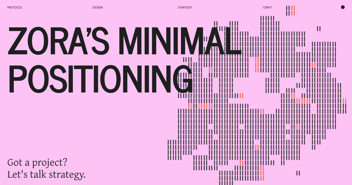
Then Zora launched with almost nothing. Black background. White text. Mint button. That’s it.
This wasn’t minimum viable product. This was intentional minimalism as market positioning.
Let’s break down how they made “less” their competitive advantage.
Where NFT Tooling Was
By the time Zora emerged as consumer product, the NFT space had established patterns:
OpenSea set the standard:
Marketplace with every feature
Search, filter, sort by 20+ attributes
Collections, bundles, offers, auctions
Creator earnings, royalties, verification
Trending, stats, rankings
Dense interface, information everywhere
Others followed:
Rarible added token and governance
Foundation added curation and social
SuperRare added galleries and exhibitions
LooksRare added rewards and staking
The pattern: more features = better platform. Competition was additive.
The interfaces reflected this:
Bright colors competing for attention
Badges, labels, tags everywhere
Multiple CTAs per screen
Information density prioritized
“Professional trading” aesthetic
Everyone was building complexity because complexity signaled capability.
What Zora Did Differently
Zora went opposite direction. They removed everything that wasn’t essential.
The Visual System
Color palette: Black, white, occasional red accent. That’s it.
No gradients. No bright colors. No illustrations. No photography. Just stark contrast.
This wasn’t because they couldn’t design colorful interfaces. It was positioning: “We’re different. We’re minimal. We’re focused.”
Typography: Helvetica-adjacent sans serif. Large, bold, confident. Generous spacing. High contrast.
The type does all the work. No need for decoration when your typography commands attention.
Layout: Generous white space (actually black space). Not cramped. Not trying to show everything at once.
Each page has one clear purpose. One clear action. No clutter.
Imagery: The NFTs are the only color. Everything else is black and white.
This makes the art stand out. The interface disappears. The creation is what matters.
The Feature Set (Or Lack Thereof)
Look at what Zora doesn’t have compared to competitors:
No marketplace features:
No bidding system
No offers
No bundling
No collections in traditional sense
No “Buy Now” initially (just mint/collect)
No social features:
No following
No likes/favorites
No comments
No profiles beyond basics
No discovery feed
No analytics:
No trending sections
No volume rankings
No floor price tracking
No rarity tools
No sales history graphs
No complexity:
No filters (initially)
No sorting options
No advanced search
Minimal navigation
What’s left? Mint. Collect. Create. That’s the core experience.
The Language
Zora’s copy is as minimal as their design:
“Imagine” - Their tagline. Not “The best NFT marketplace” or “Create and sell digital art.” Just: Imagine.
“Create” - Not “Mint” or “Deploy” or “Launch collection.” Create.
“Collect” - Not “Buy” or “Purchase.” Collect implies curation, not transaction.
The language elevates the action. You’re not trading. You’re creating and collecting culture.
The Protocol Approach
Zora’s technical architecture supports minimalism:
Open protocol, many interfaces:
Zora is infrastructure
Anyone can build interfaces on it
Zora’s interface is reference implementation
Minimal by design because others can build feature-rich versions
This justified minimalism. “We’re the simple version. Build your own if you want more.”
Creator-owned:
Creators own their smart contracts
Not platform-mediated
Direct creator-to-collector
No middleman visible in UI
Minimal fees:
No platform fee initially
Just mint fee for creators
Transparent, simple pricing
No hidden complexity
The business model supports minimal design. Not trying to monetize through features.
Why Minimalism Worked
Differentiation Through Contrast
In a space where everyone was adding features, removing them became distinguishing characteristic.
Look at any screenshot:
OpenSea: colorful, complex, information-dense
Rarible: busy, many options, trading-focused
Foundation: curated but still feature-rich
Zora: black, white, minimal, art-focused
Instantly recognizable. The minimalism is the brand.
Positioned for Creators, Not Traders
NFT platforms were optimizing for traders and flippers. Volume, liquidity, features for price discovery.
Zora optimized for creators and collectors who cared about art, not speculation.
Minimalism signaled: “This is for creation, not trading.”
The audience that cared about that appreciated the restraint.
Made the Art the Focus
When interface is minimal, the art stands out.
Every NFT on Zora has room to breathe. Black background doesn’t compete. Simple layout doesn’t distract. The creation is what you notice.
Compare to busy marketplaces where art competes with UI elements, badges, prices, stats. Zora gave art center stage.
Philosophical Positioning
Minimalism isn’t just aesthetic. It’s philosophical stance.
“Imagine” as tagline positions Zora as tool for creation and possibility, not marketplace for transactions.
The minimal interface reinforces: we’re about art and culture, not commerce and speculation.
That positioning attracted specific audience - artists and collectors who aligned with that philosophy.
Technical Credibility
Paradoxically, minimal interface signaled technical sophistication.
Logic: “They’re confident enough in their protocol to not need flashy UI. The technology speaks for itself.”
Minimal design can signal confidence. Busy design can signal insecurity.
Timeless Aesthetic
While other platforms chased trends, Zora’s black and white aesthetic is timeless.
OpenSea’s 2021 design looks dated in 2024. Zora’s minimalism still works.
This isn’t accident. Minimal design ages better than trend-chasing design.
The Strategic Decisions
Let’s break down specific choices:
Decision 1: Black Background
What they did: Pure black (#000000), not dark grey or gradient.
Why it works:
Maximum contrast with white text
Makes colored NFTs pop
Feels gallery-like, not commercial
Different from every competitor
Works perfectly for OLED screens
The positioning: “We’re a gallery, not a marketplace.”
Decision 2: Mint, Not Buy
What they did: Initially focused on primary sales (minting) not secondary market (buying).
Why it works:
Positioned as creation platform, not trading platform
Avoided competing with OpenSea on their terms
Attracted creators, not speculators
Simpler mental model
Aligned with protocol approach
The positioning: “We’re for creators first.”
Decision 3: Free Minting
What they did: Creators mint for free (on certain chains), collectors pay gas.
Why it works:
Removed barrier for creators
Simple pricing model
Differentiated from platforms charging upfront
Aligned incentives (succeed when creators succeed)
The positioning: “Creator-first economics.”
Decision 4: Limited Navigation
What they did: Minimal navigation. No complex menu structure. Few pages total.
Why it works:
Can’t get lost
Every page has clear purpose
Forces focus on core actions
Reduces decision paralysis
Fast to learn
The positioning: “Simple tools for complex ideas.”
Decision 5: Prominent Creator Attribution
What they did: Creator name and address prominent on every piece.
Why it works:
Reinforces creator focus
Makes attribution clear
On-chain verification visible
Respects creator ownership
The positioning: “Creator ownership and attribution matter.”
The Evolution
Zora’s minimalism has evolved while maintaining core aesthetic:
Added Features Without Bloat
Over time, they added:
Secondary market capabilities
Collections and editions
More creator tools
Search and discovery
But maintained minimal presentation. Features added don’t clutter interface.
Protocol Maturity
Zora Protocol v3 added sophisticated capabilities:
Flexible rewards
Modular architecture
Advanced creator tools
But reference UI stayed minimal. Complexity lives in protocol, not interface.
Multiple Surfaces
Zora expanded beyond single interface:
Zora.co (main site)
Create.zora.xyz (creator tools)
Mobile apps
API for builders
Each maintains minimal aesthetic. The brand is consistent.
Community Alignment
Zora’s community adopted the aesthetic:
Projects built on Zora often use minimal design
Black and white becomes associated with “Zora-native”
Cultural coherence around minimalism
Like Solana’s purple, Zora’s minimalism became ecosystem identifier.
What This Teaches
Zora’s success with minimalism shows patterns that work beyond NFTs:
Pattern 1: Less Can Be More
In category where everyone adds features, removing them differentiates.
Don’t assume more = better. Sometimes less = distinct.
Pattern 2: Aesthetic as Positioning
Visual restraint communicated values:
Art over commerce
Creation over speculation
Focus over chaos
Timeless over trendy
Design wasn’t decoration. It was positioning executed visually.
Pattern 3: Know What You’re Not
Zora succeeded partly by being clear about what they’re not:
Not a trading platform
Not for speculators
Not feature-complete marketplace
Not trying to be OpenSea
Clarity about what you’re not makes what you are more distinct.
Pattern 4: Serve a Niche Excellently
Not everyone wants minimalism. That’s okay.
Traders wanted features - they used OpenSea. Creators wanted simplicity - they used Zora.
Serving niche excellently beats serving everyone adequately.
Pattern 5: Protocol Enables Interface Minimalism
Zora’s minimal interface works because protocol is open. Power users can build feature-rich interfaces.
This only works if your architecture allows it. Monolithic products can’t use this strategy.
When Minimalism Works
Zora’s approach succeeds in specific contexts:
✓ You’re in feature-bloated category
Minimalism differentiates through contrast
✓ Your audience values restraint
Creators and artists often appreciate minimal aesthetics
✓ Your product has philosophical positioning
Minimalism reinforces values-based positioning
✓ You’re protocol, not platform
Others can build feature-rich versions
✓ Your differentiator is focus
“We do one thing well” messaging
✓ You can accept smaller audience
Not everyone likes minimal - that’s okay
When Minimalism Fails
Minimalism doesn’t work when:
✗ Users need comprehensive features
Power users frustrated by missing capabilities
✗ You’re competing on functionality
If features are your differentiator, hiding them hurts
✗ Category expects information density
Financial tools, analytics platforms need data visible
✗ You can’t commit fully
Half-minimal, half-feature-rich confuses
✗ Your positioning doesn’t support it
If you promise “everything,” minimal feels incomplete
Implementation Guide
If you’re considering minimal approach:
Start With Clear Positioning
Minimalism isn’t just removing features. It’s positioning statement.
Ask:
What does minimal say about us?
Does it support our positioning?
Will our audience value restraint?
Can we commit to it long-term?
Identify Core Actions
What are the 2-3 things users actually need to do?
Everything else is:
Nice to have
Power user feature
Can come later
Probably not needed
Focus on core. Remove or hide rest.
Design for the Art/Content
Whatever your product showcases should be the visual focus.
Zora: NFTs are colorful, interface is black/white. Art pops.
Your product: What should stand out? Design everything else to disappear.
Choose Timeless over Trendy
Minimal design ages well if it avoids trends.
Timeless:
Simple typography
Black/white/one accent
Clear hierarchy
Generous spacing
Trendy:
Gradients (date quickly)
Current color trends
Fashionable fonts
Style-heavy decisions
Accept It’s Not for Everyone
Some users will want more features, more information, more options.
That’s okay. Serve your niche excellently rather than everyone adequately.
Measure What Matters
For minimal products, traditional metrics might be misleading.
Don’t just measure:
Feature usage (you don’t have many)
Time on site (minimal is fast)
Pages per session (you don’t have many pages)
Also measure:
Core action completion
Quality of creations
Creator retention
Community alignment
Brand recognition
The Comparison
How Zora’s minimalism differs from other minimal approaches:
Apple minimalism: Perfection, polish, premium
Zora minimalism: Restraint, focus, artistic
Swiss design minimalism: Grid, system, precision
Zora minimalism: Open space, boldness, confidence
Brutalist minimalism: Raw, harsh, industrial
Zora minimalism: Gallery-like, curated, elevated
Each minimal approach serves different positioning.
What This Means For You
Ask yourself:
Is your category feature-bloated?
Minimalism might differentiate.
Does your positioning support restraint?
If you promise “everything,” minimal conflicts.
Will your audience appreciate it?
Some audiences want features, some want focus.
Can you commit long-term?
Minimal requires discipline to maintain.
What’s your core action?
Can you build entire experience around 2-3 things?
What should stand out?
Design everything else to support that.
If your answers suggest minimalism fits, consider it. Not because it’s trendy, but because it serves your positioning.
The Bottom Line
Zora proved minimalism could work in feature-obsessed category.
Black and white when everyone else was colorful. Few features when everyone else added more. Art-focused when everyone else was commerce-focused.
The minimalism wasn’t aesthetic preference. It was strategic positioning executed through design.
“Imagine” wasn’t just tagline. It was invitation to focus on creation, not transaction. The minimal interface reinforced that invitation.
Result: distinct brand in crowded market. Loyal community. Clear positioning. Timeless aesthetic.
Your category might be different. But the pattern holds: when everyone adds, removing can differentiate.
Less isn’t always more. But in the right context, for the right audience, with the right positioning - less can be everything.
Thank you :)
If your project needs design, brand, product, strategy, and leadership,
let’s talk. Work with me: hi@dragoon [dot] xyz | Follow: 0xDragoon